![]()
Digital content best practice
Quick access
Accessibility
Writing for the web
- Why online writing is different
- Make it easy to scan
- Use plain language
- Be accurate
- Make it easy to find
Accessiblity - top tips
We need to make sure that we don’t create barriers for people who are trying to access our services.
You might already know these digital accessibility top tips, but they are worth reviewing before you create any web content.
Use of colour
Make sure your colours contrast enough
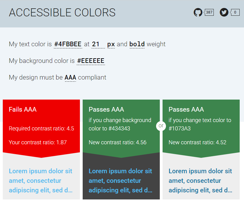
Consider the colour of the text against the background – you need to have enough contrast to allow for visibility. There are some tools to help you check this, such as ‘Accessible colors’.
This tool will check your colours (on the left on the image) and if there is not enough contrast, it will suggest a different background colour (in the middle) or a different text colour (on the right).
Avoid using colour alone to signify meaning
Some people can’t see colour well enough to notice if there’s a difference.
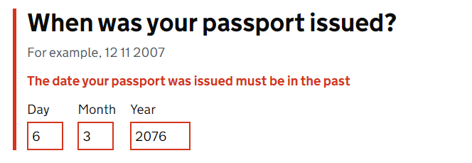
For example, indicating an error message by displaying it in red might not be noticeable. It’s better to add other visual markers as well. For example, in the image below:
-
there is a vertical red line added to highlight the area with the error
-
the error message is in red but also in bold
-
the border of the date input fields is thicker and red
<a href=”#”style=”padding: 8px 18px; border:solid 1px #00427f;text-decoration: none; font-weight: 600; background-color: #d4e5f2; color: #1a1a1a”>Back to top</a>
Links and buttons
Make the text meaningful
Some people navigate your website using a screen reader. They will often scan your website by jumping from one interactive element (a link, a button or a menu item, for example) to the next, and the screen reader will read them the text of the elements out loud.
For them, it’s really important that the text of your hyperlink or button is meaningful in itself.
Right: You’ll find more information about this in our business guides section. [The user will know the link takes them to the business guides section.]
Wrong: You’ll find more information about this here: https://www.scottish-enterprise.com/learning-zone/business-guides [The screen reader will read out the URL, which is confusing to listen to.]
Wrong: To find out more, click here. [‘Click here’ does not let the user know where the link will take them.]
Warn the user
If you are taking the user to another website or if they are about to download something, they need to know first. Examples:
Find out how to apply to this fund (will open in a new tab)
Download the application form (PDF, 25MB)
For downloads, make sure you indicate the type of file and its size.
Mark your links correctly
People with visual impairments might not see your links if they only have a slightly different colour compared to the surrounding text. Underline links for better visibility.
Leave enough space to select safely
Your users might be using a small screen, or they might have hand tremors or be visually impaired, all of which can make it difficult to select a small target. Make sure you leave enough space between your links and buttons, so they don’t have to be too precise.
Fonts and layout
Align your text to the left and do not justify
Justified text may be aligned nicely on both sides, but is much harder to read, especially for dyslexic people.
Some people will magnify their screen and can get lost in your page if you don’t align to the left. So always align left.
Avoid italics and underlining
Italics and underlined text can be harder to read, so avoid using these types of emphasis for entire paragraphs. Use only with moderation.
All caps
Text that’s all in uppercase is also harder to read as you lose the shape of the words. This makes it especially hard for dyslexic people. Avoid putting your headings or buttons in all caps, for example, unless they are an acronym (remember to explain acronyms as well).
Note that some screen readers might also read letters one by one when they are uppercase, so this can be very annoying for screen reader users.
Fancy fonts
Some people find these very hard to read – best to avoid them.
DON’T DO THIS, IT’S HARDER TO READ
this is harder too
and this doesn’t have enough contrast
Images
If you’re using images in your document that contain important meaning, information or text, make sure you add alt text. This is basically a short description of the image. This means users who can’t see the image won’t miss out on important information as their screen readers will read them the alt text.
Here is a good page that explains more about alt text and how to do it well, and also more extensive guidance. Also see this blog post about whether you should use a caption or alt text.
You don’t need to add alt text to decorative images, but ideally these should be avoided anyway, as they only distract people from their goal and slow down page load times. Adding unnecessary images to your site also has an environmental impact. Every time a page loads, it emits carbon emissions. The more data there is to load, the more emissions will be produced. You can read more about greening the web in this blog post, or calculate your website’s carbon footprint.
Media files
When using audio or video files, you need to provide an alternative for people who can’t hear or see.
Videos with audio require captions synchronised with the audio track. All the audio in the video should be represented in these subtitles. They should include names, sounds and descriptions.
Types of captions:
- Open captions: embedded in the video itself, and cannot be turned off
- Closed captioning: can be turned on and off [best solution]
Auto-generated captions are better than nothing, but usually not great. They are often inaccurate, especially if the speaker has an accent or when captioning names (people, brands, places etc…).
Captions are also useful for people who are not native speakers or who are in a noisy environment or don’t want others to hear what they are watching, for example.
Ideally, you should also provide a transcript of your media, so people can either read it or use a screen reader to hear it. Transcripts also:
- allow people to scan the content and see if they want to engage with it
- can be searched by people and search engines, so are better for SEO (search engine optimisation)
- are the only way a deafblind person can engage with your content
Audio descriptions speak out what is happening in the video so that it’s accessible to people with low vision. There are two ways to create audio descriptions:
- a narrator describes all the visual information
- there’s a separate audio track that describes the visual information
Using PDFs
Avoid publishing PDFs and other documents online wherever possible. It’s usually more effective and accessible to repurpose the same content as an HTML webpage.
Problems with PDFs:
- they do not change size to fit the browser
- they’re not designed for reading on screens
- it’s harder to track their use
- they create difficulties with navigation and orientation
- they can be hard for some users to access
- they’re less likely to be kept up to date
- they’re hard to reuse
Source: Why GOV.UK content should be published in HTML and not PDF.
However, there may be situations where you can’t avoid publishing a document online or sharing it directly with a customer – for example, when sending funding applicants an offer letter or contract. It’s important that these documents are accessible, whether they’re being shared internally or externally.
Start by creating an accessible word document and then save it as a PDF
Microsoft Word has a built-in accessibility checker. You will find the ‘Check accessibility’ function under ‘Review’ in the toolbar (highlighted in red in the picture below).
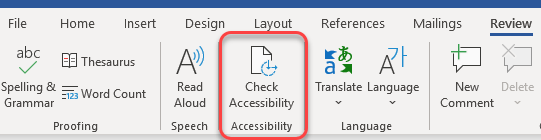
To use it:
- go to the Review tab
- select ‘Check accessibility’
- a panel will open to the right of your document
- this will highlight errors such as missing alt text or low contrast text and help you fix them
A good article about making Word documents accessible: An Accessible Word Document Checklist.
Writing for the web – top tips
Why online writing is different
Writing for an online audience is different than writing for regular print readers. When creating written content for the web, remember:
- people read differently online – most tend to scan text quickly, looking for the most relevant information rather than reading every word
- visitors may come from a variety of educational, social and cultural backgrounds, with different levels of literacy and language comprehension
- visitors may be accessing your website on the go, perhaps using their mobile
- some site visitors may have special needs when it comes to accessing information online
Here are some pointers to make sure your content is useful for everyone in your audience:
Make it easy to scan
Make sure users can glance over your content and quickly find and understand the information they need. Here’s how:
- keep sentences and paragraphs short – think small chunks of text (ideally 15 to 20 words per sentence, and a few lines per paragraph)
- try to focus on one idea per paragraph
- separate sections with clear, descriptive headers
- use lists and bullet points where appropriate
- present your most important information up-front (use the inverted pyramid model)
- avoid unnecessary capital letters, italics, bold print and other style elements that can make text harder to read
- don’t write in all caps
Use plain language
User tests show that much government information published online uses language that is too advanced for its audience.
You can improve your content’s readability by following the principles of plain English. Basically, this means using everyday, conversational language your audience will understand. Here’s how:
- replace long, complicated words with simpler alternatives - see this list of words to avoid for examples
- avoid jargon, corporate buzzwords or advanced vocabulary
- if you must use an acronym, spell it out at the first instance of using it
- use the active voice wherever possible – it’s more direct and easier to understand
- avoid local sayings or idioms that may not be familiar to everyone in your audience
Be accurate
Users need to feel confident that the information you provide is trustworthy and accurate. This means your content must be:
- factually and grammatically correct
- up-to-date
- consistent
All copy should be carefully proofread and fact-checked when it is first published. It should also be reviewed on a regular basis to make sure:
- the content is still relevant (for example, if it’s a service you provide, is it still available?)
- all details (for example, dates, addresses or prices) are correct
- any links are still working and point to the most relevant page
If your organisation has a style guide, use it to help maintain consistency and quality across your content. A style guide sets out which conventions to follow in terms of spelling, capitalisation, formatting and more.
If your organisation does not have a style guide, the UK Government’s GDS style guide is a useful resource and is used by Find Business Support.
Make it easy to find
To help visitors find information on your site, you should:
- add relevant keywords and phrases to headers, meta descriptions and body copy to encourage external search engines to direct people to the page – this is known as search engine optimisation (SEO)
- use plain language that visitors will readily understand, and which is more likely to match the queries they enter in search engines
- add tags to each page as appropriate (to facilitate internal search and filtering)
- make sure your site architecture makes sense, so people can browse for the topic they want