BETA timeline
KEY
Accessibility
Other
Lab research
Online research
Partners collaboration - co-design
-
FBS Filter Testing Aug V3
Phase
- Live
Audience
- UserTesting Generic Panel * 15 people
We were focusing on
Test new filter types and categories with the users and understand if these will work for them. Do this as a Closed Card Sort whih gives people categories and asks them to place items into them Follow this up with an Open Card Sort where people can chosse their own groupings
We explored the following things:
- What information would the users provide about their company in order to find support
- If the filter category’s make sense?
- If the items listed under each of the filter category’s make sense?
- Thoughts on the language used for categories
- If there was anything missing from the filter categories or the items under the categories.
- The order of the filter categories that users would like to see when filtering
We proposed
- What industry are you in?
- Where is your organisation based?
- What type of organisation are you?
- What are you looking for support with?
- How would you like your support delivered?
What we discovered
- They worked quite well for users
What we discovered
Learning All users were able to successfully complete the card sort exercises with ease. They categorized the items in the same way as the proposed solution (mostly, but with some overlap) Filter categories and the items within them made sense to all the users ”How would you like your support delivered?” category was less clear to the users ” What are you looking for support with?” filter category was the most important filter in terms of order of preference Overall, users found the language used for this exercise easy and straightforward When asked about the information the users would provide public sector to receive support following things were shared: their company details such as name, vat no, size, turnover, company description to issues that they were facing and the help that they wanted such as loan. We asked “What was missing”
Missing Age of Business Size of Business Brexit Covid* - Coronavirus is an option but not Covid
🧰 We Changed
Change Nothing These filters will now go to UX/DEV team for implementation review -
FBS Filters Aug V2
Phase
- Live
Audience
- UserTesting Generic Panel * 15 people
- 9 Female
- 6 Male
We were focusing on
Test new filter types and categories with the users and understand if these will work for them. Do this as a Closed Card Sort whih gives people categories and asks them to place items into them Follow this up with an Open Card Sort where people can chosse their own groupings
We explored the following things:
- If the filter category’s make sense?
- If the items listed under each of the filter category’s make sense?
- If users want an “All Scotland“ as an option under the “I am located in” category?
- Thoughts on the language used for categories
- If there was anything missing from the filter categories or the items under the categories.
What we discovered
| Learning | — | They broadly made sense to users | There was some overlap | All Scotland was welcomed under ‘I am Located In’ | The Language ws fairly straightforward | ‘I operate in’ and ‘I amd looking for support with’ were ambiguous, and where most of teh overlap occured
🧰 We Changed
Change We iterated to another set of Group Headings Decided to make teh headings sentences Decided to make the headings questions -
FBS Filter Headings V1
Phase
- Live
Audience
- UserTesting Generic Panel * 15 people
We were focusing on
Test new filter types and categories with the users and understand if these will work for them. Do this as a Closed Card Sort whih gives people categories and asks them to place items into them Follow this up with an Open Card Sort where people can chosse their own groupings
We explored the following things:
- If the 5 filter category’s make sense?
- If the items listed under each of the 5 filter category’s make sense?
- If users want an “All Scotland“ as an option under the “I am located in” category?
- Thoughts on the language used for categories
- If there was anything missing from the filter categories or the items under the categories.
What we discovered
- They did not work that well for users
What we discovered
Learning The Grouping Headings did not work that well for users The items listed within the groups did make sense The term “Outwith Scotland” was ambiguous and may only be well understood within Scotland The Language was fairly good but potentially ambiguous Users Confused “I am looking for” and “I am looking for support with” From the open card sort; 3 main categories emerged. Region, Support, Sector or Business Type 🧰 We Changed
Change We iterated to another set of Group Headings 🎧 Quotes
Quote Everything was clear but I was unsure about the ‘Outwith Scotland’ Where items can be placed in to two categories: Education, training as an example, give the option for them to sit within both. I would have to say that some of these were a bit vague but overall, It wasn’t that difficult for me to sort them in groups once I started working on this task -
Changes on the About Us page
Recently we developed a series of key messages for FBS that explain the site’s vision, design and function. This information gives background and context both to the public and to our partners and other stakeholders, who can also use the messages as a reference when speaking about FBS to their own audiences.
To make sure this information is prominent and easily accessible, we updated the content on the About Us page to reflect the new messages. This includes sections on:
- the purpose of the site
- how it can help businesses
- why it was created
- who runs it
- site usage, visitors and newsletter subscribers
The page also still carries a list of our partners and information on the help and complaints processes.
We subsequently added another short section on the rationale behind the site design and how it improves our green credentials.
-
Changes on the Covid page
We looked at the analytics for the Covid page for the last month. Over 56% of pageviews are for ‘browse support’ after visiting the Advice page in the past 2 months. This is good we want them to go there.
What the analytics tells us for the past month
- the ‘Coronavirus funding’ button has only had 0.22% of pageviews (26)
- the ‘Coronavirus guidance’ button has had 0.05% of pageviews (6)
- most users are going to ‘browse support’ - ‘browse support’ has had 72.36% of pageviews (8,479)
- the homepage link has been more popular than the 2 buttons (homepage - 1.58% of pageviews (185))
- even the ‘Quick Guide’ has had more pageviews from the Covid advice page (1,07% of pageviews, 125 pageviews) (Note: it’s the last link on the page)
- users have been ignoring the buttons and/or these topics are possibly not the priority for users anymore
What we decided based on this
- the buttons are at the best place (high on the page) so they are unlikely to get better use elsewhere on the page so we removed them
- Latest updates has been moved up
-
Operate after Brexit
Audience
- 4 potential customers, using Video calls (Microsoft Teams)
What we tested
Focus
- What challenges are businesses facing around trying to operate after Brexit?
- Where would businesses go for information about operating a business after Brexit?
- What do users think of the content and layout of the page?
- Is there anything missing from the page?
- What would users do if they came to this page and couldn’t find the information that they needed?
Summary of insights
- People like that there is a link to FAQs but they want more detail (which you can get on SE.com)
- No one commented on the Funding/Events buttons – they aren’t getting down far enough on the page
- People like the SE.com Brexit pages in terms of the content, style and layout but are less keen on FBS
- A few people mentioned that they would expect to see a list of sectors in the ‘Advice for specific sectors’ accordion
- Someone also suggested adding more information about the funding support to that accordion section
- Everyone expects there to be a search bar
- There’s some confusion around the Brexit filter on the homepage only linking to a page with three items, instead of the whole Brexit page
Recommendations
- Send users directly to SE.com
- Add a list of sectors to the ‘Advice for specific sectors’ section
- Add some more context around what funding support is available to the ‘Financial support’ section
- Add a search bar to the top navigation
- Review the usefulness of the Brexit filter on the homepage through analytics
Files
-
Operate after Brexit
Audience
- 4 potential customers, using Video calls (Microsoft Teams)
- 4 UserZoom unmoderated sessions
What we tested
Focus
- What challenges are businesses facing around trying to operate after Brexit?
- Where would businesses go for information about operating a business after Brexit?
- What do users think of the content and layout of the page?
- Is there anything missing from the page?
- What would users do if they came to this page and couldn’t find the information that they needed?
Summary of insights
- The site and page are quite clear
- Not everyone agreed on the top three “Top questions”
- The accordions worked fine but some key information is hidden in them
- “Funding” was missed by most people as it is so far down the page, but funding is of interest
- Top Brexit issues mentioned include increased costs, supply chain issues, taxes/paperwork and employing EU staff
- Upon failure, people are split between going back to Google or the contact us page
- Some businesses are still unsure how Brexit is going to affect them
Recommendations
- Consider making content about people, workforce and skills and FAQs more prominent
- Consider moving the Funding button up higher – but only if there is going to be relevant funding for businesses to apply for. Otherwise this will lead to a poor customer journey.
- Review the top questions and possibly check to see if we have any data to see if these are actually the top things we get asked about, or consider moving this section below the accordions
Files
-
Operate after Brexit
Audience
One-to-one testing via Teams
- 6 business owners
- 3 male, 2 female
Focus
- What challenges are businesses facing around trying to operate after Brexit?
- Where would businesses go for information about operating a business after Brexit?
- What do users think of the content and layout of the page?
- Is there anything missing from the page?
- What would users do if they came to this page and couldn’t find the information that they needed?
Summary of insights
- Language is clear and direct, but too formal at times
- Businesses want Brexit guidance that is specific to their business
- Users don’t like having to leave the site to get more information
- Users want to use live chat to ask questions
- Mixed feedback on the simple style – some like it, others feel the site would be more engaging with some visuals
- Some users felt that ‘Latest updates’ should be higher up the page
Recommendations
- Look at the overall customer journey to make sure users don’t have to click too many times to get to the information that they need
- Consider making the content a bit richer and more detailed
- Add dates to items under ‘Latest updates’, or change the title of this section
- Do more research into using live chat
Files
-
Top-level menu
Audience
- Unmoderated testing via UserZoom 50 users
Audience
One-to-one testing via Teams
- 6 business owners
- 3 male, 2 female
Focus
- Share four difference screenshots of the FBS site with different top-level menu to see which one they prefer
Summary of insights
- Most people couldn’t see any significant difference between the four menus
- No clear-cut winner – not much difference between the four
Recommendations
- Users don’t have strong feelings about the menu
- When users did comment on liking a specific option, they mentioned the one with ‘Coronavirus’ and ‘Brexit’ (screenshot 4)
- It might be more useful to do an A/B test once the site is live with two options to see if it has any impact on how often the coronavirus and Brexit pages get clicked on from the homepage
Files
-
Analytics on the COVID after quick re-design
Analytics for the previous week (Mon 25 - Sun 31/01) compared to previous design
Sources of traffic - Not affected
- Google (organic): 26%
- Direct traffic: 18%
- PWA (Progressive Web App):10%
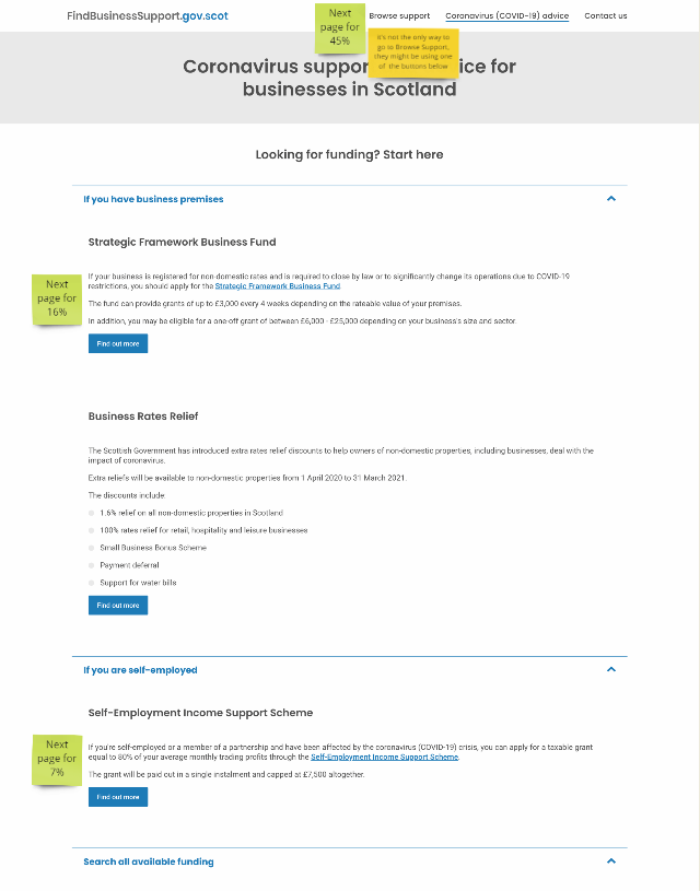
Next page visited (% pageviews) - More engagement, mostly going where we want them to go
- Browse support: 48%
- Strategic Framework Business Fund: 16%
- Coronavirus-advice: 10%
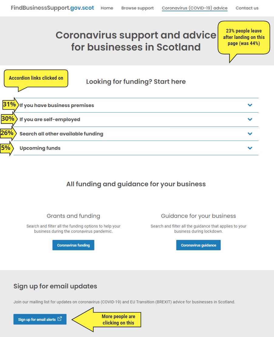
What accordion links have been clicked on the most
- If you have business premises: 31%
- If you are self employed: 30%
- Search all available funding: 26%
- Upcoming funds: 5.43%
Bounce rate - improved!
Cut by half (was 44% and now down to 23% last week). It means people are more likely to engage with the site than leave after landing on the advice page.
New quick guide to coronavirus (Covid-19) business support
Since Friday, 45% of users who come to the ‘quick guide’ leave the website there. This could mean:
- The page is not working because nearly half of users who get to it leave FBS, rather that engage with the site
- Or these users have already found the info they were looking for and this guide has not given them new info
To monitor, but it looks like this page might not be working.
Sign up for email
More people are cliking on it and registering which is good as it’s the best way for customers to be updated.
Check the data yourself
Reminder: You can check the Data Studio dashboard to see the analytics
Stats on the page
-
One-to-one user testing 27-28 January 2021
Audience
One-to-one testing via Teams
- Two business owners (tourism and retail)
- One FBS partner
- One male, Two female
Focus
- What challenges have they faced when accessing Covid funding?
- Can they find relevant funding? Where would they look first?
- Where do they expect to see upcoming funds on the site?
- Do they want to see closed funds on the site?
- How would they expect to see funds categorised?
- What would they do if they couldn’t find any funding for their business?
- Would they want to see general guidance about applying for funding?
Summary of insights
Challenges
- The government announces funds with large numbers, but when it’s divided up it isn’t much for the individual businesses
- Criteria needs to be more transparent
- A newly self-employed business without premises was unable to get any funding, and taking on premises is too risky right nowd
- Funds get announced but then they can’t find any information about them
Can they find relevant funding? Where would they look first?
- Two used the accordions, one used the CTA button
- None noticed the text link to more funding
Do they want to see upcoming funds on the site? Where would they expect to find them
- All said they wanted to see upcoming funds
- Most would expect to see them in the Browse support section - they scrolled down to the upcoming funds section on the advice page but didn’t really notice it
Do they want to see closed funds on the site? Where would they expect to see them?
- All users said no:
- “If they’re closed, they’re of no use to me”
- “It’s not worth the resource to look into them if they’re not going to open again”
How would they expect to see funds categorised?
- All said it would be useful to distinguish between grants and loans
What would you do if you came to the site and couldn’t find any funding?
- One would contact their MP
- One would just try to earn money through their business
- One would go to the contact us page and phone – they wouldn’t use the form because it doesn’t tell you how long it will take for someone to respond
Would you want to see guidance about applying for funding?
- “It’s a bit text heavy”
- Would maybe look at the FAQs or top tips
- It’s helpful to see what is needed for funding, but they would get their accountant to help
What might help
- Bullet point the criteria – keep it simple
- Keep open communication between businesses and government
- A tool where you could input your business details and it tells you which funds you’re eligible for
- Including filters for size of business or location
- Adding the closing date (or making it clear that there is no closing date) to service descriptions
Summary
- Users don’t notice the text link to all funding under the accordions
- Add the closing date (or make it clear that there is no closing date) to service descriptions
- Make upcoming funds more prominent on the advice page so users don’t miss them
- Funding guide may be of limited use to businesses that are experienced in accessing grant funding or get accountants/intermediaries to do it for them
Files
-
Intermediaries user testing 28 January 2021
Audience
Intermediaries testing via Teams, 6 participants
Summary of insights
Where they go for Covid advice
- They tend to use push notifications and spend less time actively looking for information
- None mentioned FBS
- Sources include newsletters, peers, industry bodies, Google, UK Gov
Page layout and content
- Plain and easy to use
- Upcoming funds are more important than news/updates
- “Search all available funding’ accordion distracted from the two above (This has now been changed to “Search all other available funding”)
- Closing dates on funds would be welcome
- Phone number should be prominently displayed
- More information should be at the top of the page
- Upcoming funds should be a filter option in Browse support
- No interest in closed funds
Summary
- They are using a variety of push sources of information (newsletters, email alerts, etc)
- The top (accordion) options were everyone’s first choice
- “Grants” is our language and not necessarily business speak
- Lifestyle and household issues are impacting work practices - flexibility is a competitive advantage
- Future funding is of interest
- Strategic Framework funding took an early reputational hit due to inconsistent delivery and low approval rates
- Technology inequities (capabiltiy and experience) are making communication harder for some businesses
- Phone and email preferred over live chat
Files
-
Analytics on the COVID page Monday 25 January
Early analytics for the Coronavirus advice page fresh re-design
Sources of traffic
- Google (organic): 27%
- Direct traffic: 15%
- PWA (Progressive Web App):10%
Next page visited (% pageviews)
- Browse support: 45%
- Strategic Framework Business Fund: 16%
- Self-employment Income Support Scheme: 7%
Note: ‘Browse support’ can be reach via 3 different ways: top navigation and 3 buttons taking you to that page with filters preset for covid.
What accordion links have been clicked on the most
- If you have business premises: 24%
- If you are self employed: 22%
- Search all available funding: 18%
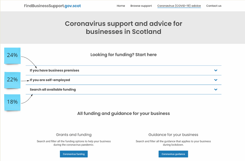
Comparing bounce rates between Sunday 24 and Monday 25
- Sunday 24 January: 41%
- Monday 25 January: 24%
It’s too early to start looking at trends since the new changes have only been live for less than 24 hours. But it might be of interest to note:
- 60% of visitors left FBS once they got to the ‘old’ advice page
- For the ‘new’ page, this has dropped to 32%.
The lower percentage could mean visitors are more likely to stay on FBS. Warning: The fact that it’s a Sunday compared to Monday might add other factors than just the redesign.
Check the data yourself
Reminder: You can check the Data Studio dashboard to see the analytics
Visual of the changes before/after
-
One-to-one user testing
Audience
One-to-one testing via Teams
- Three business owners, all male
- One in the creative sector
- Two in food and drink
Focus
- What do users think of the layout and appearance of this page? https://findbusinesssupport.gov.scot/coronavirus-covid-19-advice-c (You can see a screenshot of that page when tested)
- Can they find relevant funding?
- Do they want to see upcoming funds on the site?
- Do they want to see closed funds on the site?
Summary of insights
What worked:
- Users like the clean, uncluttered layout
- The Funding and Guidance buttons were used by all
- Last updated dates on service descriptions were appreciated
- Highlighting funds for business rates payers/self-employed -“This splits it quite clearly”
What didn’t work
- The cookie banner covered the fold, so not all users saw that there was more content below
- The content below the fold had no headings and was hard to scan
- Technical issue with the browse support search bar for the user on a Mac
Can they find relevant funding?
- All users eventually went to the Funding button on the advice page, but two went to read guidance first
- One user used the sector filter, one used search and the other just scrolled
Do they want to see upcoming funds on the site?
- Two said yes, one was more focused on closed funds
- Time to prepare for an upcoming fund application was important
Do they want to see closed funds on the site?
- Mixed feedback - one said no, another said yes, another said if they were there, they should be clearly highlighted
Recommendations
- Keep the layout simple and uncluttered
- Retain Funding and Guidance buttons at the top
- List upcoming funding and grants – more research may be needed on the best way to do this
- Tweak the layout so the cookie banner doesn’t cover the fold
- Add opening and closing dates to service descriptions
- See if we can make better use of email alerts
Files
-
Analytics on the COVID page links
We looked at what links were the most used on the main coronavirus advice page between the 6 and 19 January 2021.
Out of the 185 links on this page, 32 were responsible for 90% of the traffic.
(PDF below illustrate this with green stickies for the ‘high traffic’ links. yellow stickies for the others)
In parallel we also removed links to resources which were now out of date (things are moving fast!) or not as relevant anymore.
Most of the links in the top 32 are supports (nearly all funding) which customers can find from the ‘Browse support’ page. So these links have been removed from the main coronavirus advice page as a new design (testing with customers at the moment) will allow to get the results for Coronavirus support or Coronavirus advice at the top of the page.
Files
- Download the Excel spreadsheet of the number of clicks for exist links from main page over the 6 to 19 January 2021
- Visual of redesign of the page showing the number of clicks as post it on that page (PDF)
-
Online testing (January) of Coronavirus advice page layout
Audience
- 13 Scottish business owners and senior business leaders
- Unmoderated UserZoom testing
Focus
To understand what users think of the layout and appearing of the adivce page (https://findbusinesssupport.gov.scot/coronavirus-covid-19-advice-c), if they can find relevant funding, and if they want to see upcoming funds on the site
Important note
- The page we were testing with was being tweaked as the test was running, which may have had an impact on test results
Summary of insights
What do users think of the layout and appearance of this page?
- Users find the layout clear, concise and easy to navigate
Where would do you on this page if you want to fund coronavirus funding support for your business? (Scenario: you’re a clothing business based in a shop)
- 38% would go to the Strategic Framework Business Fund under ‘If you have business premises’
- 31% would go to the Funding section and filter on ‘Retail’
- 8% would use a search engine
- 8% would go to ‘If you are self-employed’ because it’s a small business
- 8% would go to ratepayers and then to the to the retail section [Note: the ratepayers accordion has now been removed and replaced with ‘If you have business premises’]
- 8% would look for funds for businesses that have been asked to close down because they’re non-essential services
Are you able to find a government fund that looks suitable for your business?
-92% said yes
Where would you go on this page if you wanted to find out about upcoming funds that weren’t open for applications yet?
- 46% would go to the Upcoming funds for February 2021 section
- 23% would go to the Funding section
- 15% weren’t sure
- 8% would sign up for email alerts
- 8% would go to the Coronavirus advice tab
Do they want to see upcoming funds on the site?
- 85% of users said yes
Overall summary
- Users like the clear, simple layout – keep the site uncluttered
- Most users are using the new ‘Looking for funding? Start here’ accordions to look for funding, but some will go to the main Funding tab
- Keep upcoming funds on the site
- Some users missed the ‘Upcoming funds for 2021’ section on the advice page because it was below the fold. Some users expect information about upcoming funds to be in the main Funding section.
Files
-
Online testing (January) of opinions about upcoming funding
Audience
- Scottish business owners and senior business leaders
Focus
To understand how businesses feel about seeing information about upcoming funds (10 people)
Summary of insights
Upcoming funds
- 100% of users said that they would like to see information about coronavirus funding that is coming soon but isn’t open for applications yet
- Most users would expect to see information about upcoming coronavirus funding on the coronavirus advice page, and some also mentioned the homepage
Where users would look for coronavirus funding
- 40% of users would go to the coronavirus support page
- 30% would go to the coronavirus browse section
- 10% said they would start with Google by searching for terms like ‘funding scotland small business’ or ‘coronavirus scotland business support’
- 10% said they would use site search
- 10% said they would look on the website for ‘digital boost for my business’
Files
- FBS upcoming funds user testing (Will download a PowerPoint file)
-
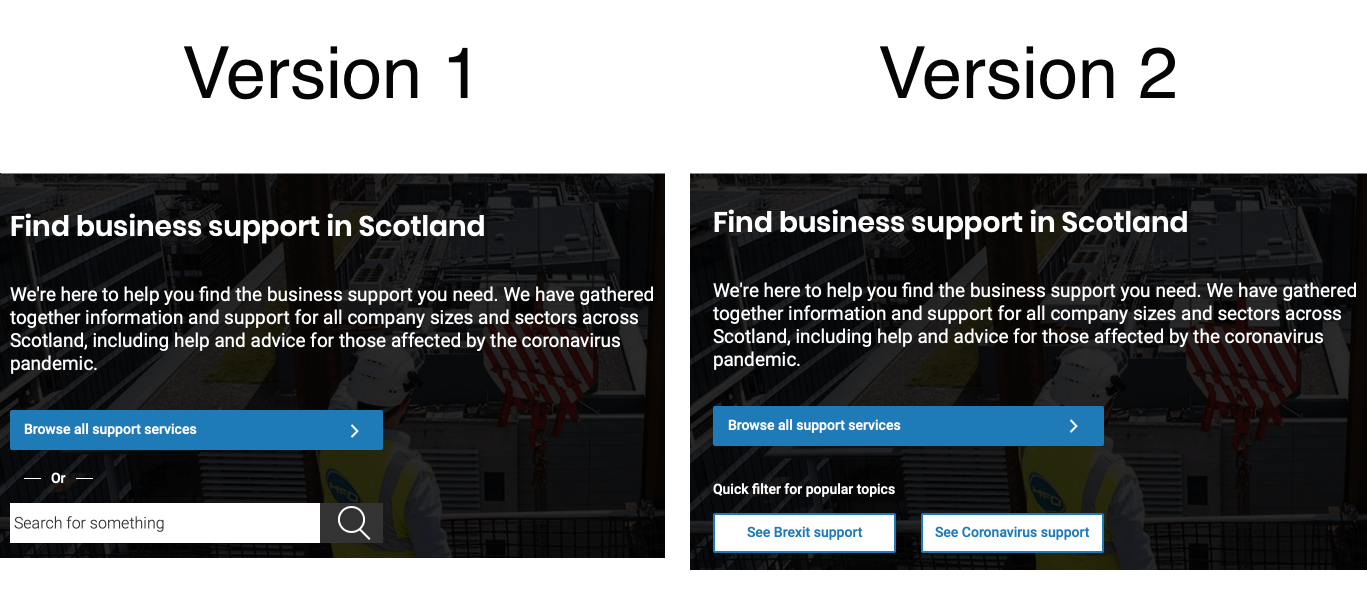
Online testing (November) of Search Prototype
Audience
-Scottish & UK Business owners
Focus
To test functionality around
- Search Prototype (10 people)
Summary of insights
Search Prototype overview
Two homepage versions were tested against each other
- V1 has a search box on the homepage. This loads the Filtered View with Search prepopulated.
- V2 has buttons that lead to the Filtered View.

V1 Comments
- I think it was more simple and easy to understand
- Much easier to use.
- Search bars are very effective, but they need quick filter options to make them fast and effective.
- The search box was easy to use, but I found the other designs were fine too. I chose the search box because I am more used to using sites with this function.
V2 Comments
- Quick filter options give people the opportunity to quickly find the general information they need which will then allow them to search for other related information.
- Easy to use and good it has brexit and covid as topical filters
- It is an attractive design and seems pretty easy to navigate.
Files
-
Online testing (July) of Homepage, Covid 19, Route Map Prototype & Industry Filter
Audience
-Scottish & UK Business owners
Focus
To test functionality around
- Homepage & FBS site
- Covid 19
- Route Map Prototype
- Industry Filter
Summary of insights
Homepage & FBS site
- The layout is appreciated
- The uncluttered pages are easier to users
- It has lots of useful information
- Outdated information is not removed quickly enough (It is still visible)
- The site lacks a distinct personality
- Topic search should be more prominent
- Live chat would help confused users
Covid 19 Page
- Easy to navigate
- Calendar Dates are appreciated
- It covers both, Near and Longterm issues
- The Topic based search works well
- The Topic based search should be higher on the Page
- A chatbot or some other interaction method would help users when they are confused
- The information can be overwhelming. It could possibly be summarised or tiered.
- There could be longer lists of Q&A rather than just collated top ones
Route Map Prototype
- All users liked the concept of route map and shared positive comments about the map – simple layout, easy to understand, very informative, readable and visually pleasing.
- There was some confusion as to the number (1 to 8) in the middle of the page and some felt jumping from left to right could be avoided.
- Some mentioned it would be good to have filter by industry option or a search box.
- All 10 users would like this map to be made available on the website:
Industry Filter
- Users found the new industry filter easy to use, simple and easy to find.
- Simple, plain, easy to use, logical were some of the comments made by the users.
- Some dislikes included the design being a bit bland, colourless, some sectors being left out like farming, finance, digital.
- Users understood what the “other sectors” industry tag meant and were happy with the search results displayed when it was selected.
- Overall users were happy with the search and filter options that were available under the browse support web page.
Customer Quotes on Route Map
- “It shows to workers and owners that there is a plan in place for re opening and creating a safe environment”
- “I think this route map is a really clear and defined way of letting businesses and the general public know what the rules are. I’d much rather use a route map like this than try to wade through all the detailed information and try to keep track of the changes myself or remember when they become live”
Files
-
Online testing (June) of Filters, Content Placement, Enquiries Portal
Audience
-Scottish & UK Business owners
Focus
To test functionality around
- Covid-19 advice (10 users)
Summary of insights
Guidance Filter and Homepage
- Majority of users (6 out of 10) liked the new homepage image and shared following comments:
- New normal, Pleasant, Welcoming, Relatable, Well chosen
- And some (4 out of 10) felt:
- Woman behind laptop doesn’t particularly show support, Uninspiring, It’s a bit dull
- There were lots of positive comments about the current filters in the “browse support” section:
- Easy to use and understand, well structured, simple
- And some negative comments such as:
- Not a lot of filters, Some search results were irrelevant, All filters should have been displayed
- There were not many suggestions around missing filters, one which comes up again and again is around the size of business – small, medium and large other than that users were content with the current filters
- We asked users to provide their feedback about a new filter called “guidance” and all (10 users) of them said that they would like this new filter introduced and that they would use this filter for the following things:
- It would be official advice
- Sounds like a channel for help
- Allows business to access latest rules
- It could contain many resources
- It’s a bit vague so not sure
Majority 8 out of 10 were able to understand that this new filter “guidance” was different to the current filter “self-help guides”:
- Self-help says self-study or ways I can advance my position. Guidance suggests thing I am being advised to do
- Guidance is very general but self-help guides are is more specific to your business
Content placement
- Majority of users (8 out of 10) would like the Coronavirus information to be displayed on the Coronavirus web page.
- Only 2 felt that all the information should sit under the Coronavirus filter under the “browse support” web page.
Enquiries Portal
- All 4 partners found the prototype to be simple and straightforward
- Looks simple to use
- Looks very straight-forward
- It looks nice and simple, I would make sure to keep it that way. No need to complicate it
- Partners would like some sort of notification when a new enquiry is received, this could be via a simple email to their inbox
- The open enquiry page was easy to understand and partners were happy to see the search and sort options. One of them felt that having an enquiry type option would help them better understand multiple requests from a company.
- The Actions button at the top was confusing to all, two felt that it was an action to fulfil an enquiry. But having clicked on the button to see “export as csv” was a good to have option.
- The enquiry detail screen was also simple and easy to understand and it was comprehensive.
- All felt that some sort of notes section while fulfilling the enquiry will be a useful thing to have as then they could see what has happened with the enquiry and who dealt with it.
- All partners were of the opinion that it would be really useful if they could fulfil the enquiry from within the system otherwise their current processes are sufficient and having an enquiry portal is pointless.
- If an enquiry was wrongly assigned to an org, they would like to send it back to the FBS central team back from within the portal by having a “send back to sender” option or something similar
Files
-
Online testing (May) of Covid Support, Challenges & Advice
Audience -Scottish & UK Business owners
Focus
To test functionality around
- Covid-19 support (10 users)
- Covid-19 opp, challenges and sectors (9 users)
- Covid-19 ThankYou page (10 users)
Summary of insights
Covid
- Version 2 was liked by majority of users and below are some comments to support this.
- Having the steps to finding out if you are eligible for a grant made version 2 the best one. It was easy on the eye and the steps made applying for a grant seem simple and not time-consuming.
- Much better layout - more understandable and informative
- More on and seemed more organised and directional
- Version 2 is basically made of version 1 with additional information which is very important, this is why I prefer version 2
- Majority users felt that the content was easy to read and understand.
- The advice pages were easy to navigate.
- Suggestions were made for further improvements
- Majority users felt that the content was easy to read and understand.
- The advice pages were easy to navigate.
- Suggestions were made for further improvements
- Sources of funding pages also tested well with users being able to navigate and read info easily
Customer Quotes
Covid Support
- Having the steps to finding out if you are eligible for a grant made version 2 the best one. It was easy on the eye and the steps made applying for a grant seem simple and not time-consuming.
- Much better layout - more understandable and informative
- More on and seemed more organised and directional
- Version 2 is basically made of version 1 with additional information which is very important, this is why I prefer version 2
Covid Advice (1st Wave)
- Hyperlinks are very useful, as long as they work and are kept up to date
- The navigation menus are well placed to point you to where you need to go.
- The contents are mostly from external links so it’s quite tricky to navigate back and forth to the source page
- clear and understandable
Covid Advice (2nd Wave)
- It provides a wealth of information and anyone would have their questions answered easily
- There was a wide variety of information on the page itself and with the individual links it made it very comprehensive
Files
-
Online testing (April) of Covid Testing Wave 1 & 2
Audience -Scottish & UK Business owners
Focus To test functionality around
- Covid-19 funding prototype (10 users)
- Covid-19 advice (11 users)
- Covid-19 advice-2nd wave (10 users)
Summary of insights
Covid testing
- Version 2 was liked by majority of users and below are some comments to support this.
- Having the steps to finding out if you are eligible for a grant made version 2 the best one. It was easy on the eye and the steps made applying for a grant seem simple and not time-consuming.
- Much better layout - more understandable and informative
- More on and seemed more organised and directional
- Version 2 is basically made of version 1 with additional information which is very important, this is why I prefer version 2
- Majority users felt that the content was easy to read and understand.
- The advice pages were easy to navigate.
- Suggestions were made for further improvements
- Majority users felt that the content was easy to read and understand.
- The advice pages were easy to navigate.
- Suggestions were made for further improvements
- Sources of funding pages also tested well with users being able to navigate and read info easily
Customer Quotes
- Having the steps to finding out if you are eligible for a grant made version 2 the best one. It was easy on the eye and the steps made applying for a grant seem simple and not time-consuming.
- Much better layout - more understandable and informative
- More on and seemed more organised and directional
- Version 2 is basically made of version 1 with additional information which is very important, this is why I prefer version 2
- Hyperlinks are very useful, as long as they work and are kept up to date
- The navigation menus are well placed to point you to where you need to go.
- The contents are mostly from external links so it’s quite tricky to navigate back and forth to the source page
- clear and understandable
- It provides a wealth of information and anyone would have their questions answered easily
- There was a wide variety of information on the page itself and with the individual links it made it very comprehensive
Files
-
Online testing (March) of Events Filters, Covid 19, Services Filter
Audience -Scottish & UK Business owners
Focus
To test functionality around
- Events Filters (16 People)
- Covid 19 (14 People)
- Services Filter (10 People)
Summary of insights
Events Filters (16 People)
- Everyone liked the new improved events filter panel layout and the position of different elements.
- Filter by location and date range were the top 2 elements users would like to use while looking for events.
- Keyword search took was the least popular option that users would use.
Covid 19 (14 People)
- Majority users were okay with them being taken to external websites.
- The Covid-19 pages were easy to read and understand.
- Finding Sick pay was okay but can be improved
Services Filter (10 People)
- 8 out of 10 users would like Sector to be added as a filter type
- Generally most users were okay with the current filters and had no further suggestions around this
Customer Quotes
- Because when you’re looking for events, I don’t think that most people would automatically free type search for a particular event so having location up is good.
- I think it’s a very good idea to put the location on the date range further up at the top.
- Easy to find the links to the most important information resources from other sites
- As a business owner, it provides all the right information i require in a straight tothe point fashion and navigates me to the right places to find that info which is great. As the Gov.uk site can be hard to navigate
- I searched for restaurants. Perhaps travel and hospitality?
- No other suggestions, it seems comprehensive
Files
-
Online testing (February) of About us, events, map, waiting list & search
Audience -Scottish & UK Business owners
Focus
To test functionality around
- About us on live website (10 users)
- Events date range (11 ussers)
- Map icons (8 users)
- Waiting list (10 users)
- Keyword search (12 users)
Summary of insights
About us on live website (10 users)
- Most users found the “about us” section easy to read and understand
- They felt that the language was plain and simple and they liked the content. It was concise and informative.
- Small no of users, felt the section to be bland, that the lines and paras were too long and found it difficult to follow.
- Few commented on the bad formatting, spacing and information being repetitive
Events date range (11 ussers)
- Most users found the improved date range design easy to understand (all users) and use (10 out of 11). They were easily able to select the specified dates to test the functionality.
- They felt that it was a simple and straightforward design and date selection was easy.
- Small no of users (4 out of 11), felt the section to be bland and lacked colour and contrast (when compared with the background).
- Few (2 users) commented that the date range should be higher up on the page. Ability to type in dates was also suggested by some users (3 out of 11).
Map icons (8 users)
- The users were shown two different versions of events map icons – version 1 (red/blue colours) and version 2 (blue colours) and majority preferred version 2
Waiting list (10 users)
- 3 versions of waiting list functionality were shown to the users and majority preferred version 3
Keyword search (12 users)
- Search function worked very well across the board and users liked that it was simple, easy to use and that the search results were comprehensive in most cases
- Some dislikes included the layout, lack of sub-categories, predictive text not being available and irrelevant or no results for some search keyword(s)
Files
-
Online testing of Categories, Event Map & News Update
Audience
- Scottish Business Owners
Focus
To test functionality of
- Discovery - About Us and “Programme” category feedback (15 users)
- Events map function (10 users)
- News and update prototype (10 users)
Summary of insights
Discovery - About Us and “Programme” category feedback (15 users)
- All 15 users would find an “about us” section helpful and majority would like to see this section on the website
- They felt that some introductory information about what’s on offer on this website and which organisations are involved in this would benefit them
- When asked about “type of support” options, majority (13 out of 15) said that they understand these options and “programmes” category made sense.
Events map function (10 users)
- Users were easily able to locate the events and the map feature; however, some were expecting an events tab / button on the homepage.
- Majority (8 out of 10) were able to find the specific Glasgow event and most users found it easy to find it on the map.
- Specifically talking about the icons 4 out 6 found it difficult to understand what the different icons meant – users were unsure about the colours, they wanted a key / legend.
News and update prototype (10 users)
- All users found the “news and updates” section helpful and majority would like to see this section on the website
Files
-
Retrospective with partners
Audience
- Partners from BG, HIE and SDS, members of the delivery team who were the most involved with the partners
Focus
To reflect on the work we have done with the partners these last months on SEP to improve the way we work together
- what worked well
- what didn’t
- what we should stop/start doing
Summary of insights
- Playbacks/standups/demos were overwhelmingly positively viewed
- Partner working was also very positive
- Can we think of a way to collaborate more? Have regular face to face sessions with partners
- Workstream approach was broadly positive but we need better communication between workstreams and a clear understanding of their roles
- User-centred design approach is good but we should make use of existing research from partners
- We delivered for Beta but we need a shared vision and roadmap for future development
- The D1 assessment is a good approach and should be embraced as a methodology
- Transparency could and should be much greater
- Communication could be much better and we should consider alternative platforms (eg MS Teams)
- Prioritisation could be improved
- We should reconsider our delivery model
- A lack of dedicated resource for the next phase of SEP could be a blocker
-
User Vision testing
Audience
- 6 participants with various range of access needs: Asperger, Dyslexia, visual stress, registered blind, ADHD. NVDA and JAWS users.
Focus
- Testing SEP with customer experiencing accessibility issues
- End to End testing
- feedback links on the service page were not tested
Observations
Top issues - some are not SEP specific
- Use / over use of tooltips
- Use of list boxes, where users didn’t understand how to interact with them properly
- The reading order of the listings page on a screen reader (You Search and then……no results. Just lots of Filters).
- Tabs: how they are used and what happens with the filtering options when changed
- The business address drop down form (people didn’t know that the manual entry was a selectable option)
- Terminology: browse support vs browse all support / browse vs search / order of info on the find out more buttons
- Framing / design of the search and filters to make it clearer what the user is doing
- Managing the link/jump off to other sites, new pages are opening without warning
- CTA and next steps links on each details page. People didn’t understand the nuances between them or what the partner website meant
- All caps letters for buttons (hard to read when dyslexic)
In addition there were a number of WCAG 2.1 specific issues which were observed. They need to be fixed as well in order to comply with recent legislation on Public Sector Website Accessibility.
Documents
- report from User Vision to come in January ( will be added - not available yet)
- sense making session done on the 11/12/19 - as slides (PDF)
- sense making session done on the 11/12/19 - Miro board (PDF)
-
Scot Export event
Nov 12th 2019 at the Glasgow Technology Innovation Centre
Audience
- Circa 800 Exporters or people looking to export
We were focusing on
- Testing Feedback emails (ratings and surveys)
- Testing options to improve the jump from our site to external events providers sites (usually partners)
- Preferences around complaints
- Researching assisted digital experiences and preferences
What we discovered about the Event Links
- People preferred the text “This link opens a different website in a new tab” over “This link opens in a new tab”
- People prefer the text ABOVE the link button (they say it flows better)
- The shorter text prototype had no whitespace in between it and the text above which may have reduced it’s popularity
- Quote “The text above is clearer to understand”
- Quote “The text above the button tells you what it is going to do before it does”
What we discovered about the feedback/rating emails
- The emails have too much text and people just wouldn’t read it
- If people were happy or angry about FindBusinessSupport help received then they would just click on the rating scale and not bother about the text.
What we learned about complaints
- Most people said they would complain by phone BECAUSE it would be dealt with quickly an it would be a HUMAN interaction that would avoid sending emails back and forth
- Some said they would complain via any known contact that they had with us
What we discovered in general
- Not as much chat around Brexit as in previous events
- Lots of people are aware of SDI and have had dealings with them
- Many (but fewer than for SDI) have heard of Globalscot and some have had dealings
-
Lab Research
At Taylor McKenzie - Glasgow - Lab
Audience
- 5 SME staff with a variety of Cognitive Issues
Focus
- Testing SEP with customer experiencing Cognitive Issues
- Customer UAT - End to End testing
Observations
- Issue around not opening a new tab when clicking on a Service/Product. It currently DOES open a new tab for Events
- Issue around not being obvious when a link is jumping off to another website
- The site was so clean that it did not raise any Cognitive Issue Specific problems apart from minor content alterations that could be made. These centred around “Giving the reasons behind strong statements made on pages”. This could be shortened to “Tell me why…”
Documents
-
SEP Customer UAT
Audience
Focus
- Customer UAT - End to End testing
- Feedback email content, testing
Observations
- The site was praised for being clean and easy to use
- The meta data on Support Options and Events was widely praised at it negated the need to pogo in and out of listings to check the basics
- Issue: It is not being obvious when a link is jumping off to another website
- Issue: The grey footer was modestly criticised, (only on the homepage), but only in the absence of anything serious to point out
- Issue: No method for reusing the address/company search after initial use.
Documents
-
SEP Customer UAT
Audience
Focus
- Customer UAT - End to End testing
- Brexit
Observations
- The site is viewed as being similar to GOV.UK and customers “Get it”
- The site is viewed as being similar to GOV.UK and customers “Get it”
- The homepage image was modestly praised
- The address/company lookup was widley praised
- The meta data on Support Options and Events was widely praised at it negated the need to pogo in and out of listings to check the basics
- Issue: It is not being obvious when a link is jumping off to another website
- Issue: The grey footer was modestly criticised, (only on the homepage), but only in the absence of anything serious to point out
- Issue: No method for reusing the address/company search after initial use.
Documents
-
Lab Research
Audience
Focus
- Event Categories
Observations
- Categories are quite clear
- Categories are easy to use
- Distance filters were popular
- SUGGESTION: Add a category for STAGE OF BUSINESS (Start Up, Growth, Exporting etc…)
- Issues around default distance which is now being taken up in ongoing research
Documents
-
Home Page images
Audience
Focus
- Home page images
Observations
- Most people are fairly indifferent to the homepage image
- There is a slight bias towards one of the new images but not enough to really justify changing it
- White text on top of image is still not ideal
- ps. They are not really that bothered about the grey footer, even though it looks a bit dull
Documents
-
Lab Research
Audience
Focus
- Testing INTERFACE content
Observations
- Looks a bit formal. Like a WORD document
- Could do with indicitive time frames
- Needs a contact Tel: number
- Too much Jargon
- Shorter is better
- Covers a lot
Documents
-
Internal User A11Y research
Audience
- Internal & Partner users
Focus
- Internal research on the potential accessibility impact for the internal users
Observations
- The potential risk is mostly Umbraco which is the only new system internal staff will be using
- The rest won’t be any worse than it is at the moment as it’s their As-Is processes mostly
- One potential risk to keep in mind is how we deal with the regular communications among partners in the future and during the onboarding process
- Reporting to review once we know more about what form it will take
Documents
-
New Parners & EFRS Workshop
Audience
- Contacts with Visit Scotland and Interface - Workshop on Knowledge base
Focus
- Assessing the way to work so the new partners can receive their enquiries in their CRM
- Technical discussions with the development SEP team to refine the work done and remaining
- Discussion with EFRS to see how to use the actual Knowledge base and impact on the process to add new services
Observations
- We will need an interim solution for the API
- Need to be able to add custom events
Documents
-
SLAED Meeting
Audience
Focus
- Presenting the work done so far and sense making with them
Observations No real new needs, but some confirmed:
- Need to be able to add custom events
- Eager to get reports and more insights about who their customers are
- Want routing to the correct local authority and to be able to cross sell their specific local products
-
Lab Test with Pre-Starts
Audience
- Lab testing with 5 Pre-Start customers
Focus
- Prestart Customer testing
- General end to end usability testing (on QA environment)
Observations
- Clearly Laid Out
- Labels are good
- Easy to use
- Like that the form is very simple
- Contact us and Enqury forms look the same
- Would like a phone number in the enquiry success message
Documents
-
Workshop with partners
Audience
- Partners (Core 4: SE, BG, SDS, HIE)
Focus
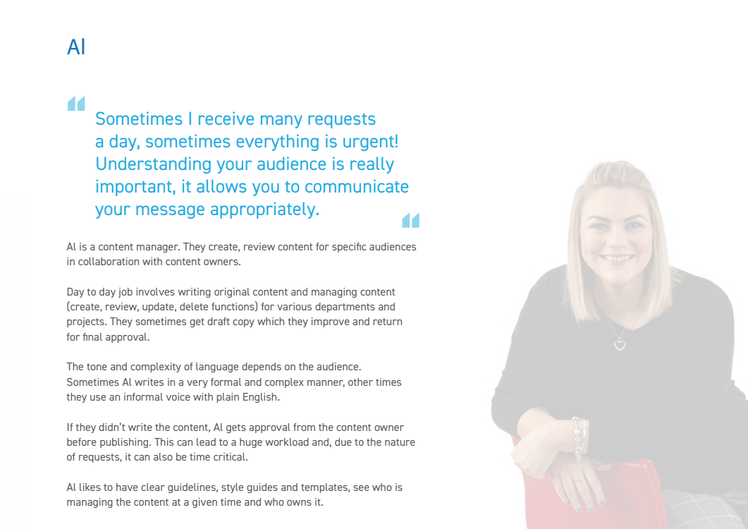
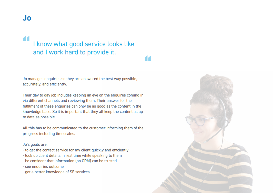
- Co Design the Service Content Management System (Umbraco) and assess the access levels needed
- Discuss the service content life cycle
- Create two new persona (content manager and Enquiry Handler) based on the needs of the partners and the person in these roles in the SEP delivery team
Documents (Observations) Personas and refined storymap
-
Lab Research
Audience
- 15 Unmoderated and 3 Face to Face
Focus
- Test Feedback options for Null Results scenario
Observations
- Top Right or Bottom Right, is where people expect to see a phone number
- People are pretty split on Phone vs Email vs Form Vs Chat
- If Chat is there then it HAS to be a real person behind it
- When time is limited, people are more likely to fire off an email and wait for a response
- If they are in a rush, then they would call.
- Forms only make sense to people with spare time and not in a rush
- Forms inherently breed distrust and need work done to overcome this
- Short Forms are OK. Long Forms lead to people just phoning instead
- The options displayed got generically favourable responses
Documents
-
Online Research
Audience
- 5 Unmoderated and 3 Face to Face
Focus
- Enquiry Form testing
Observations
- Both the forms are very simple, short and easy to use
- The big green tick on the success page was welcomed
- Business and Address lookup tested well
- No major frustrations were observed
- Small Fonts were an issue at the top of the forms
- People want guidance on how to frame their qurstion or message
Documents
-
Workshop with partners
Audience
- Partners (Core 4: SE, BG, SDS, HIE)
Focus
- Refine the needs and agree consistent process for enquiry handling (all day in Stirling) + follow up Skype calls
- Refine the service content needs with the SEP content designer
- workshop with EFRS to assess Knowledge Base needs for them
Observations Agree refined needs
- Agree reporting stop at the point of successful signposting to correct partners
- Re-routing if mistake as we do now
- BG routing automatically based on postcode
- Should ask if trading or not and adjust the form based on this
- Could ask for size of business if trading
- Agreement that we need a unique SLA for all for initial answer
Documents
-
SEP Events
Audience
- 45 from Userzoom Onlime Panel
Focus
- SEP Events
Observations
- Filters worked quite well
- Use of the map is a matter of preference and is fairly evenly split
- People expect to be able to search by both./either Post Code and Town
- Milage options need to cover a lot of distance and granularity to reflect the different sensibilities between central belt and more rural areas of Scotland. The numbers change between Support & Events. Neither of these numbers matched with the number on the home page (because that is the sum of both of these). This confused people
Documents
-
Workshop
Audience
- Partners
Focus Playback our results for partners portal with the wider team - technical interviews about enquiry handling
- services content management: sense making with the wider team and partners
- enquiry handling - more interviews with partners and EFRS
Observations Refined needs
- The only thing we really need a portal for is to manage service content, reporting can be done elsewhere and no time to build a Knowledge Base from scratch so will use the existing KB
Decisions
- Decision to use Umbraco for service content management
Documents
-
Workshop
Audience
- Partners
Focus Refine the initial findings from the initial workshop
- Services content management (partner portal)
- Enquiry handling
Observations Refined needs They all want minimal disruption from their actual ways of working, so:
- Enquiries direct in their CRM
- Events in their event provider to be fetch via API and added to SEP automatically
- Ideally no duplication of product content sources
- Knowledge base was not really something they wanted to use, and were happy not to have access to it. They would just use the SEP website as their knowledge base
-
Workshop
Audience
- Partners
Focus Workshop to set initial user needs for the partner portal and the enquiry handling
- Services content management (partner portal)
- Enquiry handling
Observations
- Initial general needs
- Login: remember me option
- Add, delete, edit content
- Automatic removal on a set date – automatic start too
- Some sense check content mechanisms before it goes live (Preview / QA)
- Use their own workflow processes to manage their own content (incl approve/reject, reasons for reject, etc)
- Partner collaboration: share product info, customer information
- Analytics, reporting, Key KPIs, Metric, Audit trails, GA
- View feedback from customers
Documents
-
A11Y research and improvements
Audience
- Mix of A11Y Audit/Expert Review, and collation of issues from previous research rounds
Focus
- A11Y Improvements based on issues found during research implemented over 2 sprints in June
Observations
- Not overly technical fixes
- Lots of core usability issues that are accentuated for A11Y audiences
Documents
-
A11Y Research and improvements
Audience
- Mix of A11Y Audit/Expert Review, and collation of issues from previous research rounds
Focus
- A11Y Improvements based on issues found during research
Observations
- Not overly technical fix’s
- Lots of core usability issues that are accentuated for A11Y audiences
Documents
-
Presentation of position so far
Audience
- Trade team and project group
Focus
- Reason for project and current understanding of direction and progress
Documents
-
Lab Research
Audience
- 5 business owners or Senior Decision makers
Focus
- General Usability Testing
- Usability testing (End to End)
Observations
- Issue: TRUST is still an issue because people are not sure who the site is. Gov.Scot helps but does not fully remove the issue.
- Issue: Information density is too low on the search listing pages
- Location is the top requested filter option
- Company Stage/Size is the next most requested filter option
- Address lookup still has issues and needs to be improved
- Search is not returning partial matches from incomplete strings (Scot should find Scottish)
Documents
-
Online Research
Focus
- Support habits and opinion research
- General layout benchmarking Usability Testing
- Scored on Impressions, navigation, layout, information & general functionality
- Enquiry Testing
Observations
- EARLY DAYS AND A BIT OF A KICKING
- GOV.SCOT is good
- ISSUE: Main CTA is not prominent enough
- ISSUE: Text over picture is not easy enough to read
- Issue: Not enough informatiuon density (Too much white space)
- Issue: SUPPORT OPTIONS is not well undestood as a term
- Eligibility and Costs need to be at top of page
Documents
-
Beta Initiation
SEP Beta phase started on 18th of April 2019